The Official Logo of Pure Junk Media, graphic designed by Pure Junk Media of Waterbury, CT. The word Junk is written in capitol letters filling the space of the rectangular logo. The word Pure sits atop the end of the J in small black text. The word Media is in white text and is cut into the bottom right leg of the K.

The Power of Color

How it can transform your website design & Branding

Perhaps you never realized how crucial of a role colors play how a a crucial role in how  customers perceive your brand. The power of color can affect potential customers behavior, and even influence their purchase decisions. In this article, we will explore the impact of color on website design and branding. We will also discuss how businesses can use color psychology to their advantage and create a strong brand identity that resonates with their audience.

Website design is much more than just aesthetics. Every design element, including color, has a psychological impact on visitors. Color is an essential element of website design and branding. It can affect the way visitors perceive your brand and has the power to evoke emotions, convey messages, and create a lasting impression on customers. In today’s digital age, where competition is fierce, the right color choices can set a brand apart from its competitors and create a memorable brand experience.

The Psychology Of Color

Color psychology is the study of how colors impact human emotions and behavior. It’s a fascinating field that can provide valuable insights into how businesses can use color to influence customer perceptions and behaviors. Here are some important things to know about color psychology:

  • Colors can evoke different emotions: Every color has a unique psychological impact. For example, red is associated with excitement and passion, while blue is linked to calmness and trustworthiness.
  • Cultural influences matter: Color meanings can vary across cultures. For example, while white is associated with purity and innocence in the Western world, it represents mourning in some Eastern cultures.
  • Context matters: The context in which colors are used can also impact their psychological effects. For example, red can signify danger in a warning sign but represent love in a Valentine’s Day promotion.

Color and Brand Identity

Color plays a significant role in creating a brand identity. It can help your brand stand out, communicate its values, and build trust with customers all without most even realizing. Here are some ways businesses can use color to strengthen their brand identity:

  • Choose colors that reflect the brand’s personality: Brands can use color to convey their unique values and personality. For example, blue is associated with trust and security, green with growth and harmony, yellow with optimism and energy, and red with passion and excitement.
  • Consider color combinations: The combination of colors used can also impact the brand identity. Brands can use complementary colors to create a vibrant and energetic look or use contrasting colors to create a bold and modern appearance.
  • Consistency is key: Consistency in color usage is essential for building a strong brand identity. Brands should use the same color scheme across all marketing channels, including websites, social media, and print materials.
Pure Junk Media is
your digital marketing experts!

Color and Website Design

Color choices can significantly impact the user experience of a website. The color scheme of your webpage can help create a cohesive and intuitive website design that leads to increased engagement and conversions, or if improperly utilized turn customers away before they even get their foot in the door. Here are some important considerations when using color in website design:
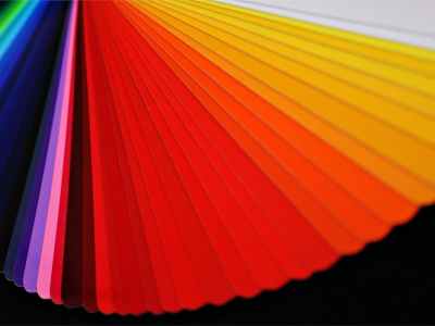
  • Balance is key: The color scheme should be balanced, with the right mix of neutral and accent colors. A harmonious color scheme can help create a visually appealing website that is easy to navigate.
  • Use a limited color palette: when it comes to color, less is often more. Using too many colors can be overwhelming making your website seem busy, and even worse confusing for visitors. Stick to a limited color palette of 2-3 colors to keep your website looking cohesive and professional.
  • Contrast is essential: High contrast between the background and foreground colors is necessary to ensure legibility. This is particularly important for text, where readability is essential.
  • Use color to guide user attention: Businesses can use color to guide users’ attention to specific parts of the website. For example, a call-to-action button can be highlighted with a bright color to make it stand out.
color-fan-g9be81866b_1920-2

Color and Conversion Rates

Since color directly affects how potential customers interact with your brand it’s no surprise that color choices can have a significant impact on website conversion rates. The right color scheme can help create a sense of urgency, increase trust, and influence purchase decisions. Here are some important considerations when using color to increase conversion rates:

  • Contrast: Choosing colors that have good contrast can help important elements stand out on the page, drawing users’ attention and increasing engagement.
  • Call-to-Action Buttons: Color can be particularly effective in influencing the behavior of users when used on call-to-action (CTA) buttons. High-contrast colors such as orange, red, and green have been shown to increase click-through rates.
  • Cultural Considerations: Color meanings can vary by culture, so it is important to consider the cultural backgrounds of your target audience when choosing a color scheme and to keep this in mind when designing your webpage.

Subscribe

To get the latest from Pure Junk Media straight to your inbox.

Branding and Color

By now you should have a good understanding on how essential color is as component of branding, and how it can have a significant impact on how a company is perceived by its audience. Here are some additional important things to keep in mind when choosing a color scheme for branding:

  • Consistency: Consistency is key when it comes to branding. Using consistent colors across all touchpoints helps to establish a strong brand identity and increase brand recognition.
  • Differentiation: Using unique colors can help a brand stand out from competitors and increase visibility. However, it is important to strike a balance between differentiation and consistency to maintain a strong brand identity.
  • Color Association: Color can create strong associations with brands, products, and services. For example, Coca-Cola’s use of red has become closely associated with the brand over time, helping to establish a strong brand identity.
  • Target Audience Considerations: As with website design, color meanings can vary depending on your target audience, and you want to make sure you’re website is appeal to who you want landing on it. Making sure your brands color scheme is appealing to those you wish to do business with should be a strong consideration.
The Wrap Up:

Color is a powerful tool for website design and branding. Having an understanding of the impact of color on user behavior can help businesses make informed decisions about color choices and significantly increase the effectiveness of their online presence.

By using color to enhance the user experience you naturally increase conversion rates, and strengthen brand identity, businesses can create a competitive advantage in their industry. Working with a partner who has the experience and know-how to use color design to take your website design and branding to the next level can help set you up for success. Consider working with a marketing company like Pure Junk Media to develop a comprehensive strategy that leverages the power of color in your favor.

If you’re ready to take your online presence to the next level, contact Pure Junk Media today and let us help you design a website that meets your needs and exceeds your expectations.

To dive deeper into the world of color, we recommend visiting Colormatters.com for a more in-depth exploration of all things color.

For some additional web design help be sure to check out our article, Designing a Website from Scratch.

More From The PJM Digital Survival Guide

Pictures By: in order of appearance

Cover and Header Photo by Andrew Ridley

Francesca Saraco

Avantrend

Miguel A. Padrinan

The Official Logo of Pure Junk Media, graphic designed by Pure Junk Media of Waterbury, CT. The word Junk is written in capitol letters filling the space of the rectangular logo. The word Pure sits atop the end of the J in small black text. The word Media is in white text and is cut into the bottom right leg of the K.
Pure Junk Media
P.O. Box 91
Oakville, CT 06779
(203) 721 - 0643
sales@purejunkmedia.com

Share this:

Like this:

Like Loading...
%d bloggers like this: